Written by: Farah Hassan
Date: 2022-06-01
Three landscapers, three ideologies, one message
Landscape architecture’s historical roots run deep and wide. There has always been an evident connection between landscape and art; the integrity and principles of creating memorable outdoor spaces for the public’s enjoyment. By dissecting the landscape theories and ideologies of some of the greatest landscape architects and their different approaches to color in the landscape, we’ll be assimilating the correlative linkage between landscape and art, and how the work progressed over the years is shaping an immensely rich and diverse landscape lexicon that we surround ourselves with.
Color can evoke emotion, at the same time perform a core role in imposing order on a site which is particularly practical in the present homogeneous society. In this article, we unfold landscape projects done by world-class renowned landscapers that incorporate color in their landscape works with distinctive forms and individual philosophies; generalizing the utilization of color in different perspectives and sets.
Piet Oudolf
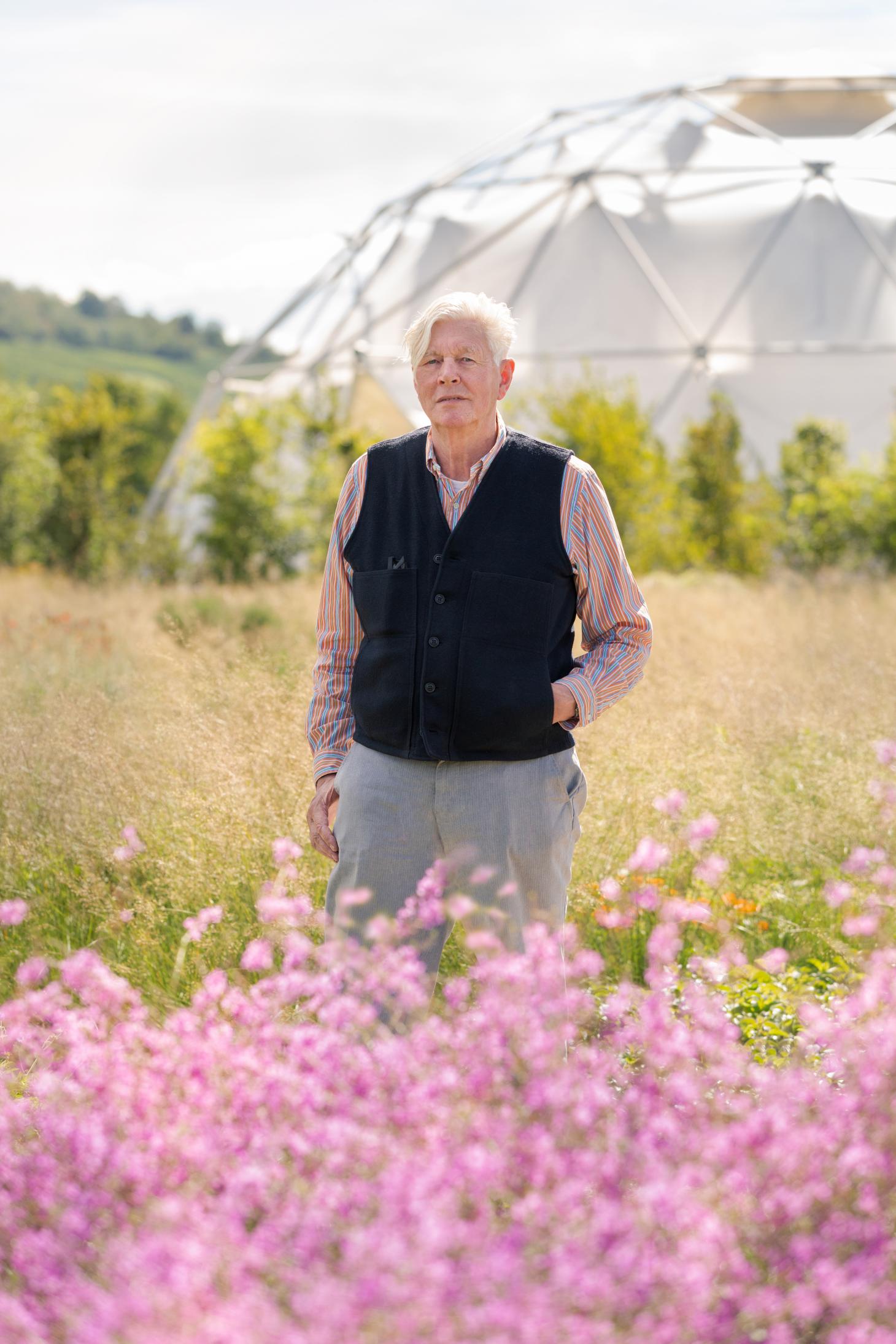
Dutch designer, Piet Oudolf, famed by the High Line in New York and comparable with Burle Marx, both were masters in phytology and utilized associations of plants enriched the landscape with intense, infrequent hues and spontaneous shapes which in return have given an immense impact to a whole generation of landscape designers all over the world. Piet Oudolf leads the ‘New Perennial’ movement to incorporate various herbaceous perennials in his design which contributes to a natural expression of landscape. People rethink and experience the public spaces differently, deeply touched by the vitality in the sparking combinations of plants during the different seasons.
Oudolf was inspired by ecology and science, attempting to simulate the way plants grow in wild natural communities by deliberately growing perennial-based mixes randomly to achieve a kind of democratization in the area avoiding industrially mass-production or site-specific. Gardens or landscapes created by the Dutch landscaper eternally capture the “emotion” of nature brimming with small color particles in a measured balance of contrast and similar color combinations by using strong and pale hues linking color to a novel and organic visual perspective.
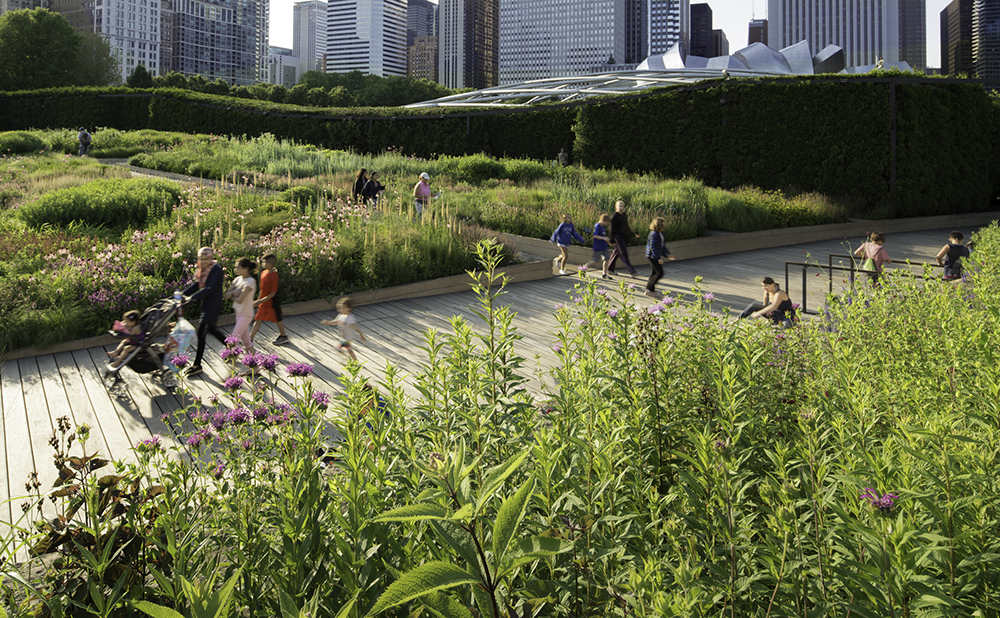
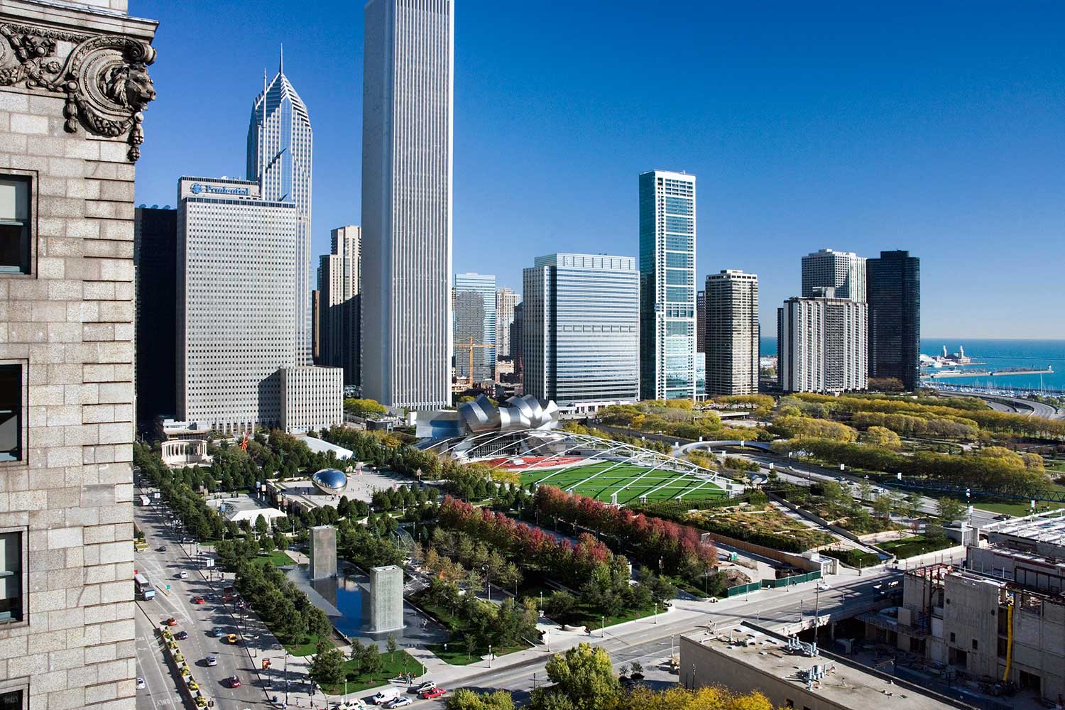
Lurie Park in Chicago is regarded as a new urban garden with a central collection on the 2.5 acres of plant clusters by Piet Oudolf. In fact, it is built over a parking garage belonging to Millennium Park. A wide timber path and a narrow waterway are settled in the middle of the area separating the site into two different regions of vegetation: the ‘dark plate’ and the ‘light plate’. The Dark Plate consists of abundantly arranged, shade-tolerant plants underplanted with open woodland to represent the
wild landscape that existed before the appearance of human settlers. Rich, comparatively dark-toned and coarse-textured plants are organized in the area with plenty of trees to form shade. The Light Plate, on the other hand, consists of a large and low-set layer where a more spacious and fine-textured landscape materializes. The garden combines native and migrative perennials planted on site to create a wild atmosphere; blending nature with old traditions of the garden. It invites visitors to discover more about ‘wild nature’ and in doing so it opens wider concepts of preservation and biodiversity.
The artificial communities are created by various different colored plants particularly perennial ones, enhancing the aesthetic of a small space by bringing back the sense of nature and reminding us, as visitors, of deep-seated emotions that come alive through a journey in his creations. In addition, his deliberately randomized association creates opportunities for large-scale sophisticated gardening in areas that were difficult to maintain.
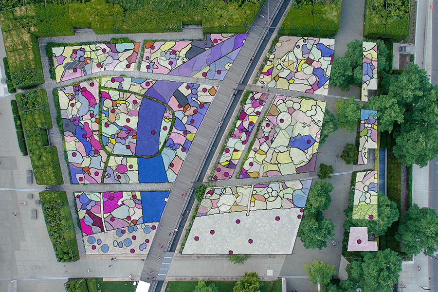
The multiplicity and sophistication of Piet Oudolf’s landscape design are well demonstrated in the Lurie Garden, from the sketches Piet made during his design process, arranging a physical and realistic spontaneous nature. Oudolf duplicates nature pragmatically by using mixed particles organized in randomized approaches with various bright colors. The miniature size and small volume of the plants are used to lead the outcome of the landscape to a vibrant but soft atmosphere.
Luis Barragan
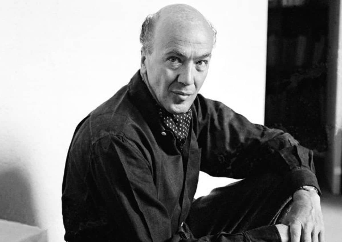
Latin American space designer, Luis Barragan merged culture and religion with personal imagination and spiritual understanding that generated an infinite and permanent work. His works included gardens, patios, terraces and interior spaces which were fully charged with emotional delight and serenity.
“The richness of color used in his design is marvelous,” Maria Durao (2010) analyzed and described when talking about Barragan’s colors that violets and Mexican rose, all tones of green, jade, sage; blue has an extremely wide range of tones: indigo, green, blue, cobalt, sapphire, turquoise; the red colors range from crimson, magenta, fuchsia, bougainvillea, carmine, vermillion, cadmium or the famous scarlet of the cochineal, from the Aztec nochezli ‘blood of the prickly pear’ extracted from millions of insects found in the Mexican cacti.
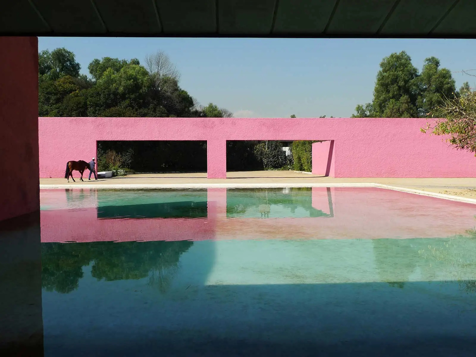
The most remarkable feature of Luis Barragan is his magical use of color, light and form, transforming the space, particularly color and shadow, to create a strong visual distinction. The concise, high contrast colors stand out from its environment, with dynamic changing of the sunlight commenced sculptural quality in the space where it would forever be eternal and constant. For Barragan, he played and experimented with them as free as a painter, attempting to discover the culminating outcome. For example, the stairwell of Barbara Meyer’s house was modified nine times before he finally incorporated the color white into it. The rough textures and materials he chose for the wall surface were influenced by the mere concept of absorption and reflection of light and as a result of nuanced patterns of shadow movement and soft changes over the course of the day. The interaction of color with light and shadow has a great impact on the composition and ambience shaping. It does not only give prominence to aesthetic decoration but resonates memories of the Mexican culture with the same hues and shades.
In Luis Barragan’s design: the reflection in the water, the sound of bells, the sculpted walls all connect to a sense of solitude and lead consciousness to shadow, light and color. In order to truly comprehend how color and light construct ambiences of spiritual meditation, Barragan studied chapels and cloisters of Mexico to develop a more internal and external relationship. The same design language can also be seen at the San Cristobal Stable, horse Pool and swimming pool; one of Barragan’s equestrian trilogies (which included two housing developments and a private estate). San Cristobal Stable is Barragan's most complicated design.
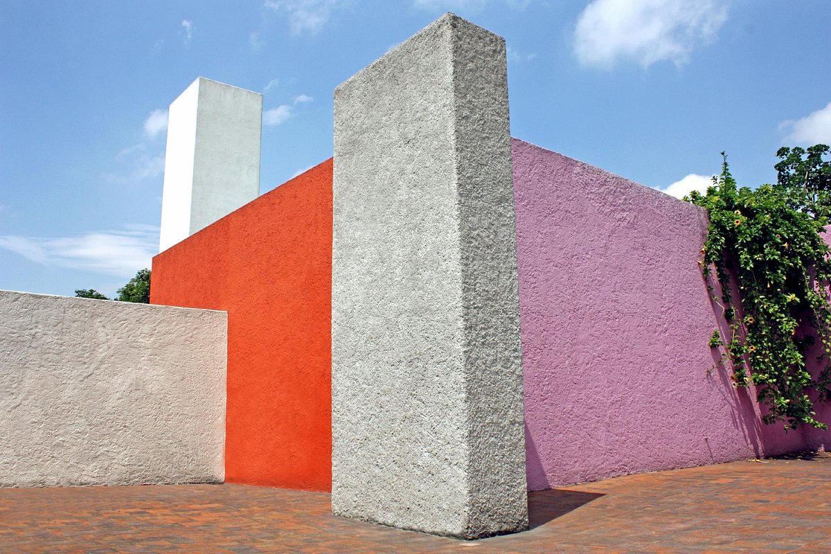
With few architectural components and extraordinary colors, he rebuilt a childhood impression of the pueblos: the house, the plaza, the horses, the friendly trees, and the water coming from very far away. The distinctive stable is made of pink and red rust-colored walls with an open, flat-water pool. The gentle down water basin is filled with dark brownstone. Going through the two openings in the long pink wall, the connected purple walls create a double visual layer both in height and color. The shadow on these hieratical walls and the reflection in the pool build a silent and elegant atmosphere, particularly under the sun. The solid wall with water running in between constitutes an ambivalent but balanced scenario in the space. The magical vision of all Surrealists is sincerely shown in the place: solid matter has a liquid core.
The lyrical and effortless genre created by Luis Barragan extends the space perception, giving the indication of space beyond. Barragan’s color incorporated religious approaches, Mexican nature, art, and simplified spaces in an atmosphere of contemplative silence and immersive tranquility. He actualized his internal mental study and understanding of perceived reality into an artistic creation, a more personal and mystical place with imagination. The reflection in the water, the sound of bells, and the sculpted walls connect to a sense of solitude and lead consciousness to shadow, light and color. In order to comprehend how color and light construct ambiences of spiritual meditation, Barragan studied chapels and cloisters of Mexico to develop a more internal and external relationship.
Martha Schwartz

When it comes to Martha Schwartz, the artistic background and recognizable peculiarity are quite hard to ignore. Born in the mid-twentieth century, when abstract expressionism reached a peak, new art movements such as Modern sculpture, Neo-dada and Pop art started to gain a more influential role in that period. Pop art and land art are the art forms that are considered to have inspired her landscape works. Stone, glass, plastic, steel, timber, tile, or acrylic are all different materials that can present color in various manners based on their textures and forms. Where some are bright, clear and glossy, others are matt, dark and fuzzy. Using materials breaks the limitations of height, shape, size and space of plants in arrangements and constructions, having a more playful and challengeable drive. As a standard-bearer of new and sustainable materials implemented in landscape design, Martha Schwartz uses vibrant colors to accentuate concepts and brings more charm and character into her projects.
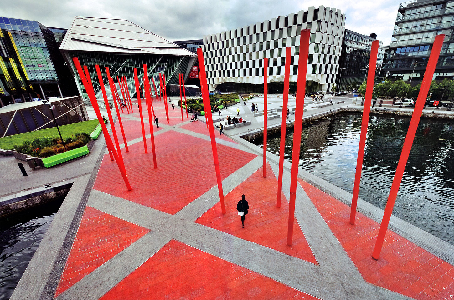
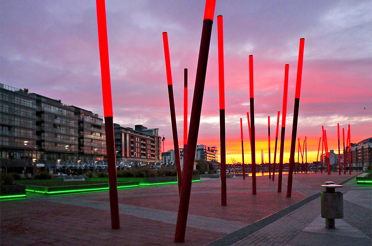
Take the Grand Canal Square in Dublin, Ireland and Power Lines in Gelsenkirchen in Germany as examples. The Grand Canal Square is perceived as a focal spot located in the Dublin Docklands Development area surrounded by contemporary architecture. The central red carpet-red resin-glass paving extends into the water, dotted with vertical, illuminated red poles. The usage of vibrant red emphasizes the dynamic movement and strength in its modern architectural expression which attracts viewers and encourages debate and character.
Another project of the power lines is an installation completely set up with typical crops covered with red plastic wraps. The extreme contrast of the “violent” red line with its surrounding green agricultural land creates a great visual impact that brings back people’s attention to a polluted and abandoned area such as this one. Other main works of Martha Schwartz such as the Splice Garden (Cambridge, Massachusetts), Jacob Javits Plaza (NYC, USA), Swiss Re Headquarters (Munich, Germany) and many more, represent enjoyable and qualified landscape workplaces in a midway between visual art or land art and landscape architecture.
Martha Schwartz’s landscape contains relatively more independent and aggressive feelings by highlighting the space with high brightness and saturation colors of new materials individually; paying lots of attention to the three-dimensional installations in the site to create a striking contrast with the environment and interactive experience with visitors.
“It is not enough that the landscape performs as a functional, intermediate fabric, as a simple break from everyday life, as a decoration around some building or just a pleasant place to be. It needs to evoke thoughts, meanings and emotions; otherwise, it will not contribute anything and remain an empty designed shell or just an attempt of changing a certain environment for the better.”
- Martha Schwartz
