Written by: Perihan El Etreby
Date: 2022-12-28
Whether you are a newbie or an expert, let's explore ways to add a wow element to your surroundings

We all deserve to live decent lives and reside in stunning surroundings that suit our interests and preferences. Our minimum and maximum havens should be peaceful, soul-pleasing spaces where we can find the peace we deserve. Every interior designer develops their own distinctive aesthetics based on their own sense of creativity. Whether you are a newbie or an expert, let's explore ways to add a wow element to your surroundings.
Always order samples
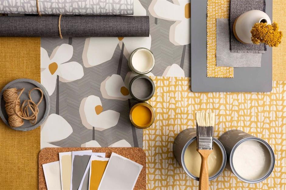
It might sound obvious, but many home decorators overlook samples when overcome with excitement about transforming their interiors. From wallpaper and paint to flooring and fabrics, you should always order a selection of samples before committing to any specific material. Place the pieces together, look at their quality and visualize how all the elements will work together in the room. You could even get crafty and create a mood board, full of all your favorite swatches.
Choose a consistent color palette
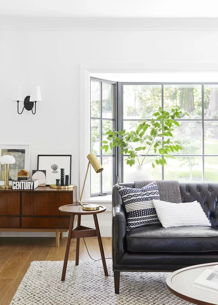
It's a common misconception that mixing pieces of different styles is a big no-no. Designer Emily Henderson assures us that we can—there's just one trick to keep in mind. "The truth is, you can mix almost any style as long as the pieces work well within your chosen color palette," she explains. "I'd say three to four colors work best."
"You should, of course, consider materials and silhouettes. Everything should look like they are at least cousins, and share some similar design DNA. But keeping your colors consistent is the safest bet for making your space look put together." —Emily Henderson, Emily Henderson Design
Raise the ceiling
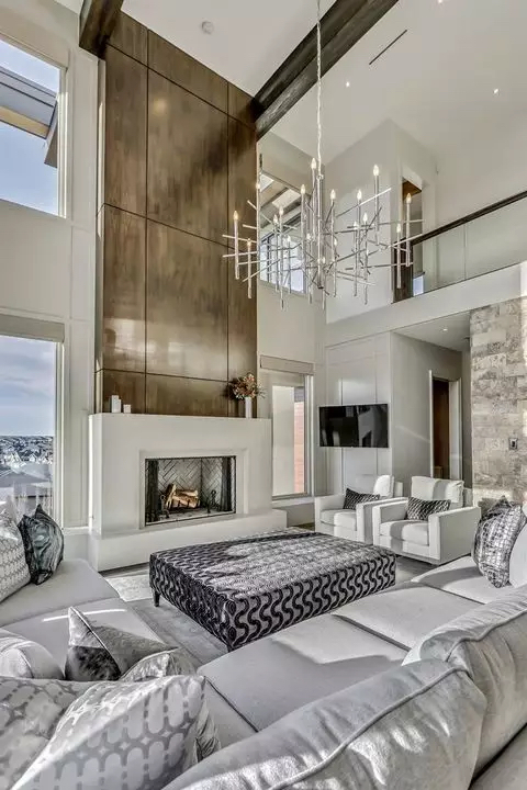
Houses with lower ceilings tend to have smaller and more restrictive spaces. Most individuals also paint their coving or cornicing in white along with the ceiling for the best interior design, especially in the dining room. The secret decorating outcome of the white paint is, that the spaces appear smaller.
The standard ceiling height is about 240cms. To achieve a heightened effect, one can paint the cornice the same as the walls. It will create a continuous flow to the eye. The decorating tip will create the effect that the ceiling starts higher creating an exaggerated space within the building.
To add to the heightened effect of your design style, you can color the skirting the same color as the walls. It will avoid the color being broken creating a longer line and a more vertical feel. You can as well exaggerate the height by drawing vertical stripes using floor-to-ceiling curtains.
Draw a focal point
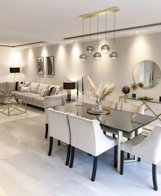
Another interior design trend is creating a stand-out feature in your spaces. The interior design idea will entice your view and draw more attention to the room. You can makeover your fireplace with statement mirrors. You can then create a decorative niche by filling it with flowers and oversized candles.
A beautifully curated sculpture can help in creating beautiful interiors for your minimalist house. Our favorite focal point can be achieved by complementing textures or wall coverings. If you have young children, you can accentuate and remodel their bedroom design by using a graphic mural or wall stickers for a perfect room look and save money on painting a small room.
Go back to basics
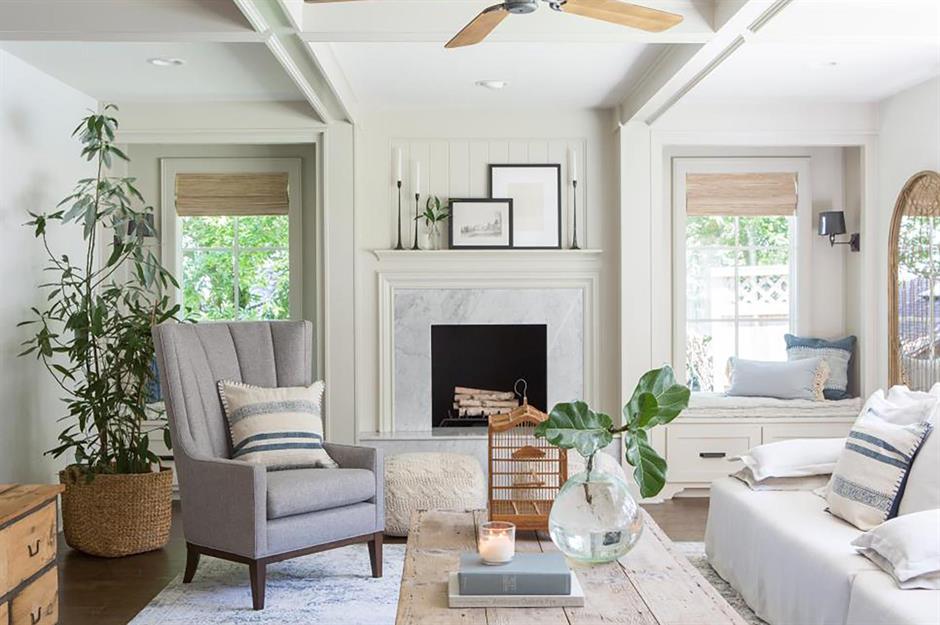
Interior design guru, Joanna Gaines’s book Homebody: A Guide to Creating Spaces You Never Want to Leave, suggests starting with crisp white walls since they "can provide a neutral and clean foundation to design around that other colors can’t, giving you more freedom to get creative with decor.” There are hundreds of whites, creams, and greys to choose from, so all you need to do is decide which is right for you.
Use large art to make a small space seem bigger
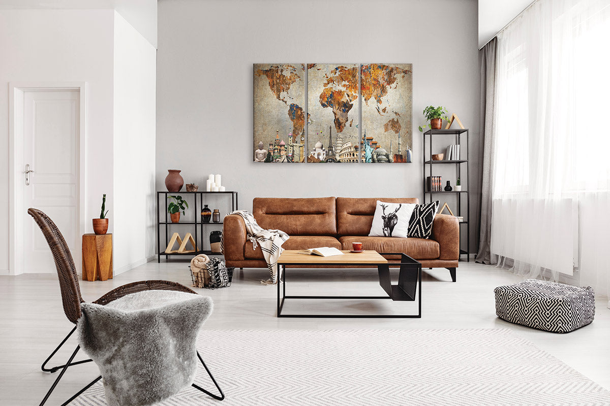
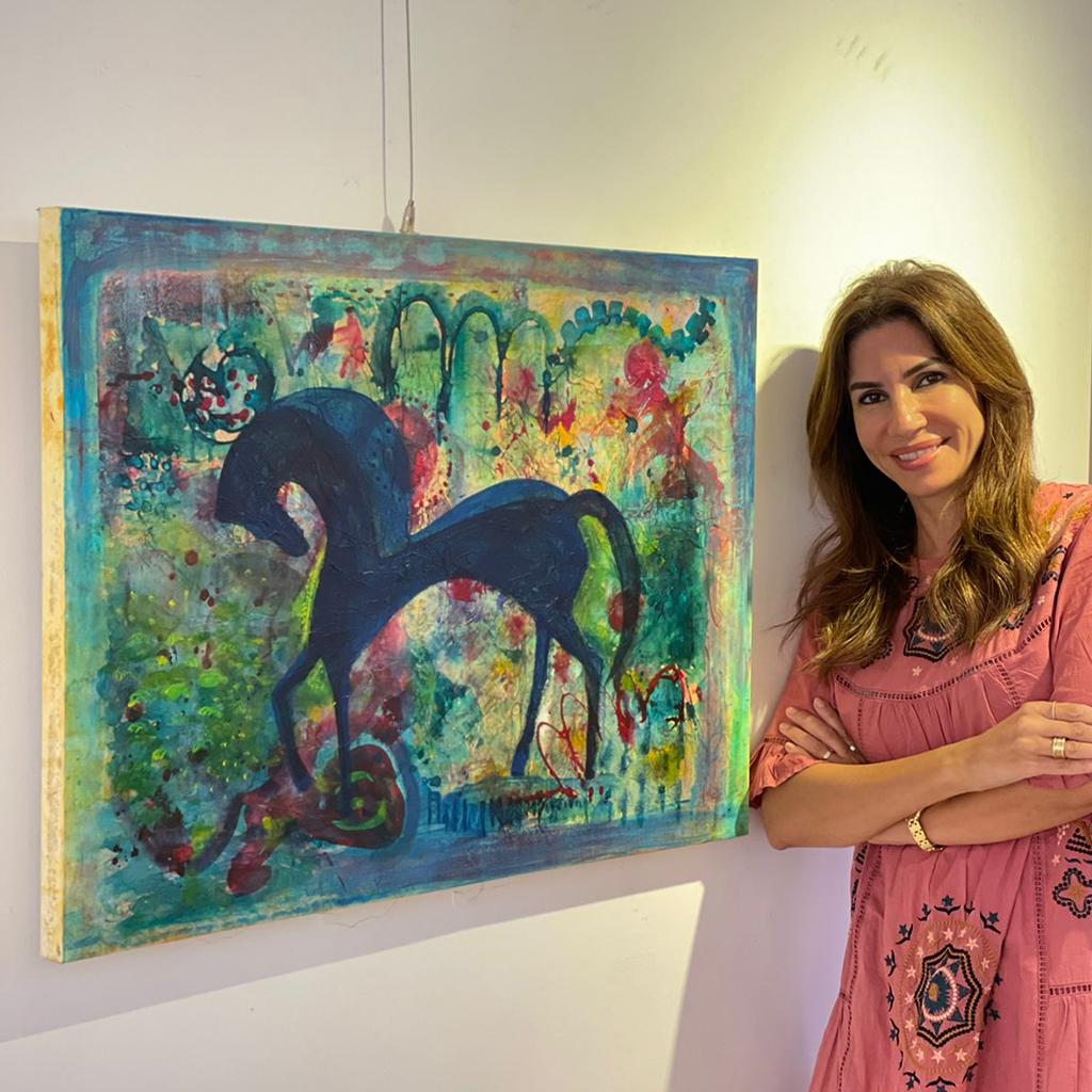
In a small space, we often assume that the furniture and art should be small, but designer Tracy Morris encourages us to try the opposite. "If you have a smaller space, try to use one large piece of art as a focal point," she explains. "One large piece of art will make the space feel larger and grander. Too many small pictures tend to chop up the space. I try to use this concept in at least one space in each client's home. It could be a foyer that needs an anchor or a smaller living room that needs a focal point."
Scheme balance
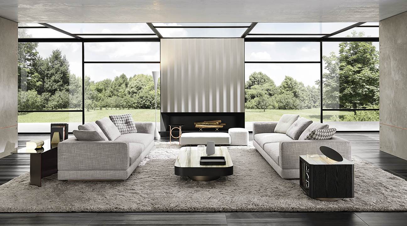
Millennial pink or rose gold accents can beautify your spaces creating a chic look. The key to winning a cohesive space lies in balancing the colors with the other elements in the room.
For example, if you want to introduce a yellow patterned cushion color, a yellow, and velvet-lined accent chair can be used in the scheme. Your coffee table can then be covered in a blue table cloth or a blue art piece can be placed on top to complement the look.
Forget symmetry
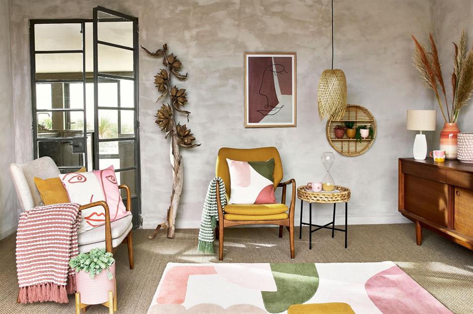
Many homeowners believe that creating a perfectly symmetrical space will result in a flawless interior design scheme, but this isn't always the case. In fact, by sticking with a symmetrical design you could actually end up with a flat space that lacks warmth and personality. Instead, aim for balance. Hang your wall art off-center, add texture to create cohesiveness, and group mismatched pieces of furniture together for a playful twist. Asymmetrical elements will draw the eye and provide plenty of intrigues.
Use performance fabrics indoors
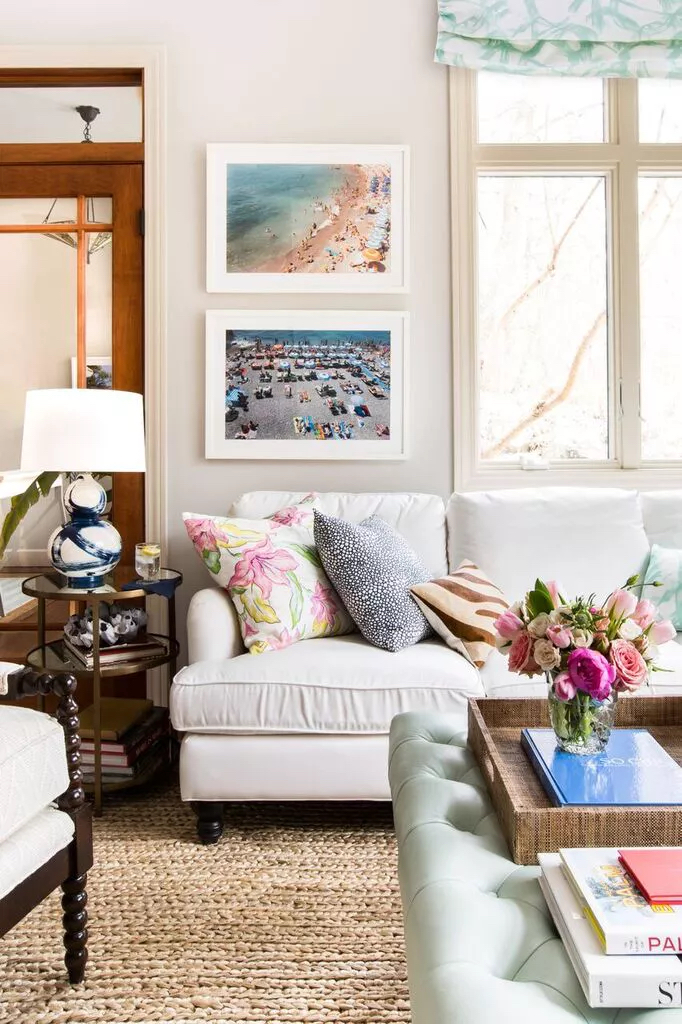
Easy-to-clean performance fabrics have come a long way and are no longer just for the outdoors. "For high-traffic areas and spaces with little ones afoot, indoor/outdoor textiles are a great solution to keep your pieces looking great, and they now feel great as well," says designer Jana Bek.
"I often have skeptics questioning my white sofa as a mom of two. I'm quick to clarify and sing the praises of Sunbrella, as most stains are easily blotted out, and the covers are spotless after a simple wash. Other great performance fabrics are outdoor rugs in entries and playrooms and for kitchen seating." —Jana Bek, Jana Bek Design
Don't be afraid to mix patterns
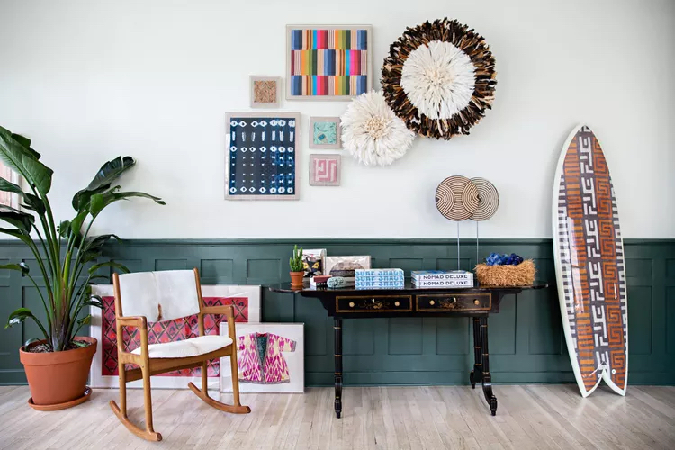
"There's little we love more than a layered look," Christina Bryant, founder of St. Frank. "We built the St. Frank brand on colorful, pattern-heavy textiles and styled them in unusual combinations. The key is to contrast the patterns—a geometric with a floral or a small scale with a large scale."
Feeling nervous? Start with an inexpensive, low-commitment element. "The easiest, lowest stakes way to start is through pairing pillows. Play around with the use of pattern on the pillows on your sofa or bed before moving to more involved surfaces such as wallpaper and drapery where this also works beautifully!" —Christina Bryant, founder of St. Frank
Personalize
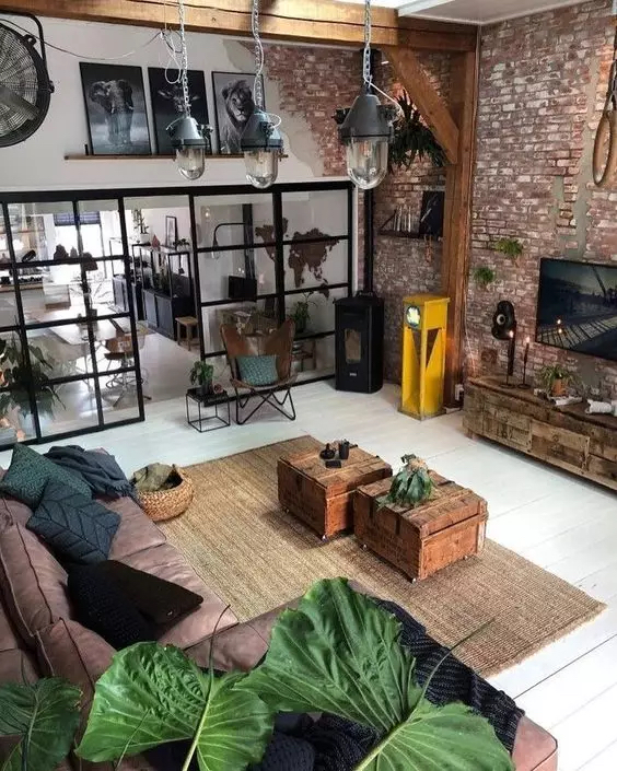
With global connections and social media, things have become generic as individuals strive to promote their personalities in the spaces. Individuals strive to draw out an extension of themselves in their spaces and incorporate it with the unique features in their homes.
However, personalizing a space does not occur once, it’s a process. When the overarching schemes have been devised and installed, more should be incorporated.
For example, you can decorate your spaces, bookshelf, and upholstery with gorgeous shells, or beautiful art pieces and textiles collected from your travels can be added. You can reminisce about happy times by adding memorable pictures, statement pieces, or flowers to your collection.
