Written by: Perihan El Etereby
Date: 2022-12-28
Let's look at the paint colors that will be more prevalent in the upcoming year.

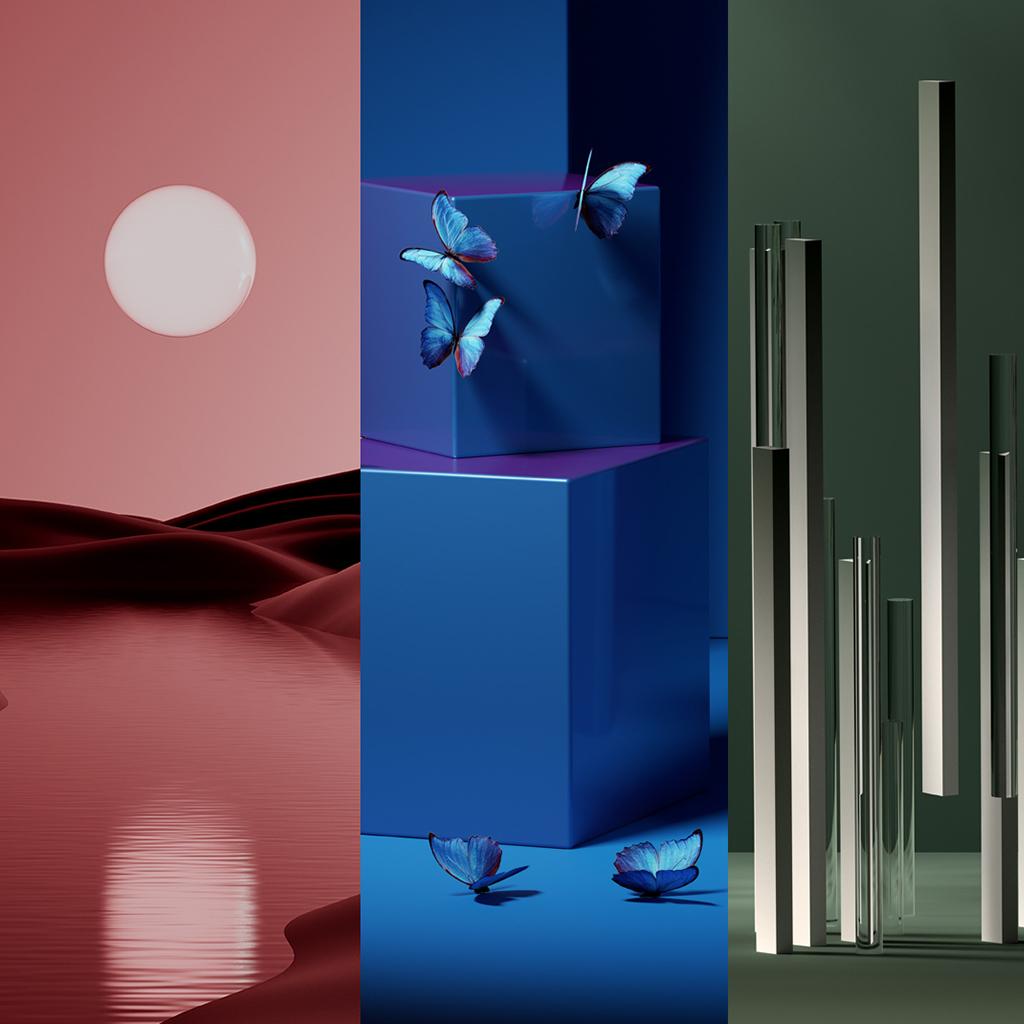
Unlike last year, when hues of green were almost universally agreed upon as the Color of the Year, this year there’s a broader mix of colors with hues that belong to one of three groups: warm pink hues, rich, deep blue-greens, or soft neutrals. Let's look at the paint colors that will be more prevalent in the upcoming year.
Raspberry Blush 2008-30
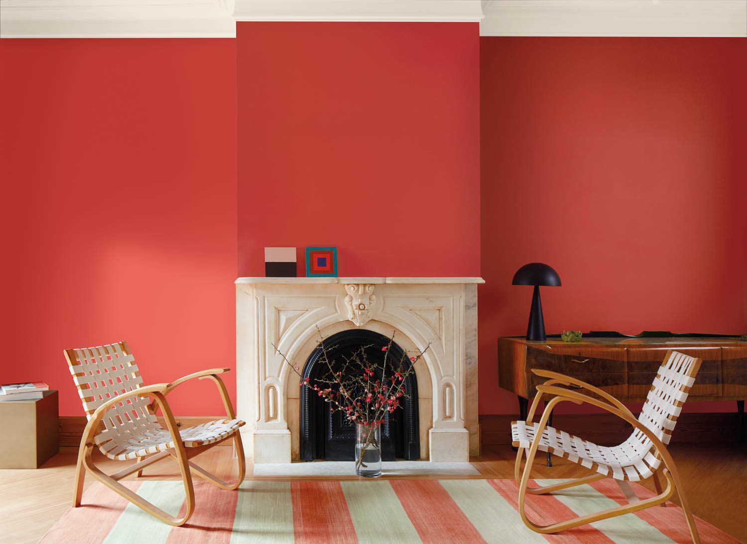
This lively color is the 2023 Color of the Year. If you want to inject cheerful energy or create a whimsical statement in a pantry or powder room, paint your walls this beautiful shade of coral.
This paint hue might also look great on a front door. It would be a lovely, warm color to greet guests with when paired with a light to mid-value neutral siding color and clean white trim.
Vining Ivy by Glidden and PPG
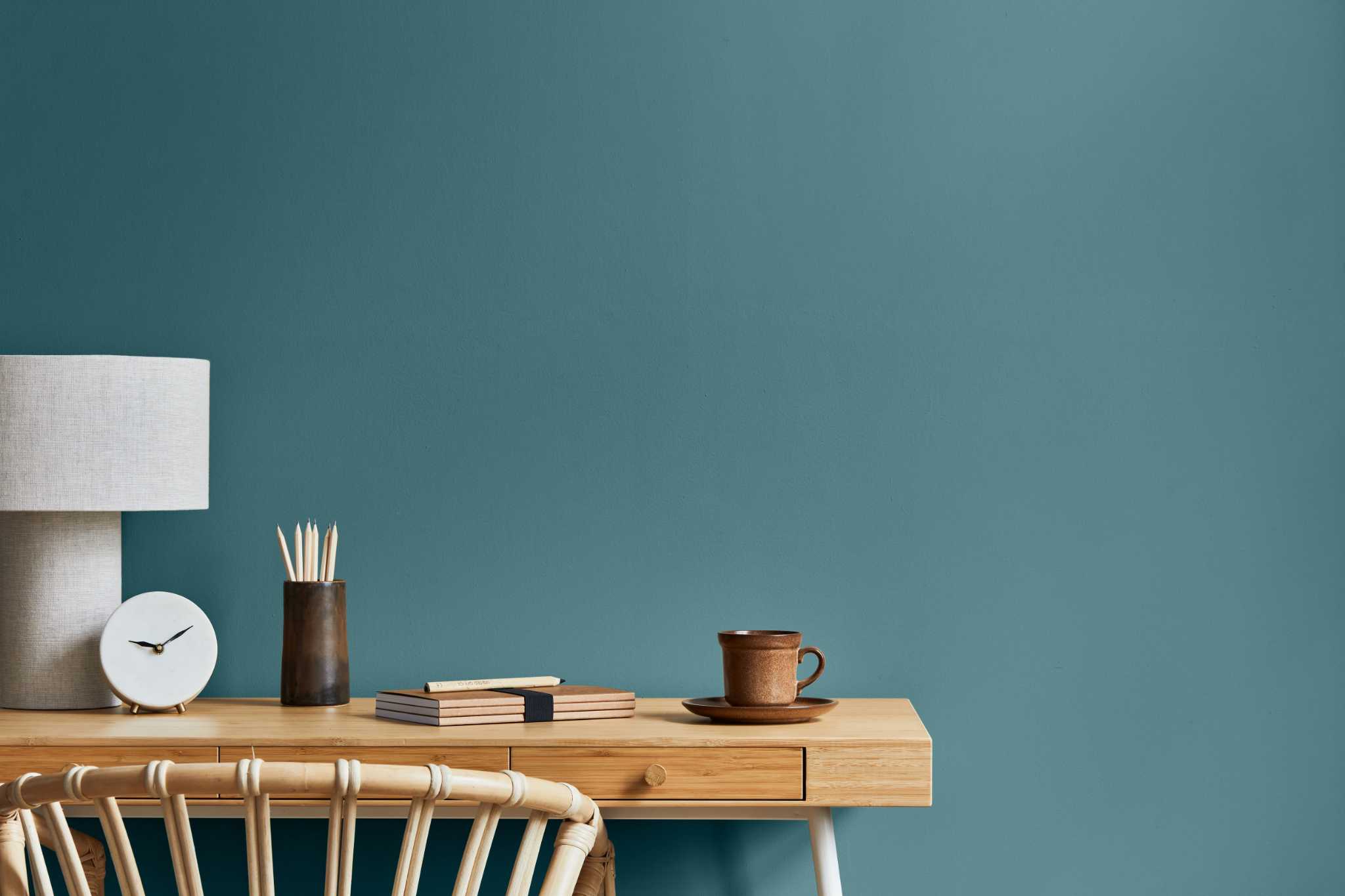
The organic greens that were popular last year have evolved into deeper, darker blue greens with an exquisite yet intimate and friendly vibe.
Vining Ivy has been chosen as the 2023 Paint Color of the Year by PPG and its brand Glidden. As demonstrated above, the gorgeous aqua-emerald Vining Ivy can be utilized to create a cozy bedroom hideaway or as an accent color in the kitchen, perhaps for the base of an island or glossy pantry cabinets.
Remember that just because another color scheme is popular doesn't mean you should change the one in your home or on it. Instead, consider these paint colors as a chance to remodel your home's interior or exterior, if necessary—but only if you find a shade you genuinely adore. Alternately, if any of the colors catch your attention, you can incorporate them into your home design; there will undoubtedly be numerous goods in these hues in the upcoming year.
Cinnamon 2174-20
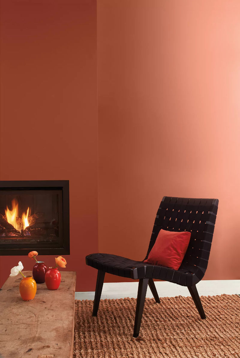
You'll adore Cinnamon 2174-20 if you're a little color-conscious. This color has all the reliable characteristics of a neutral but adds a touch of warmth due to its faint orange undertones. For a warm atmosphere, add a dash of this fiery color to your communal areas.
Valspar's Everglade Deck
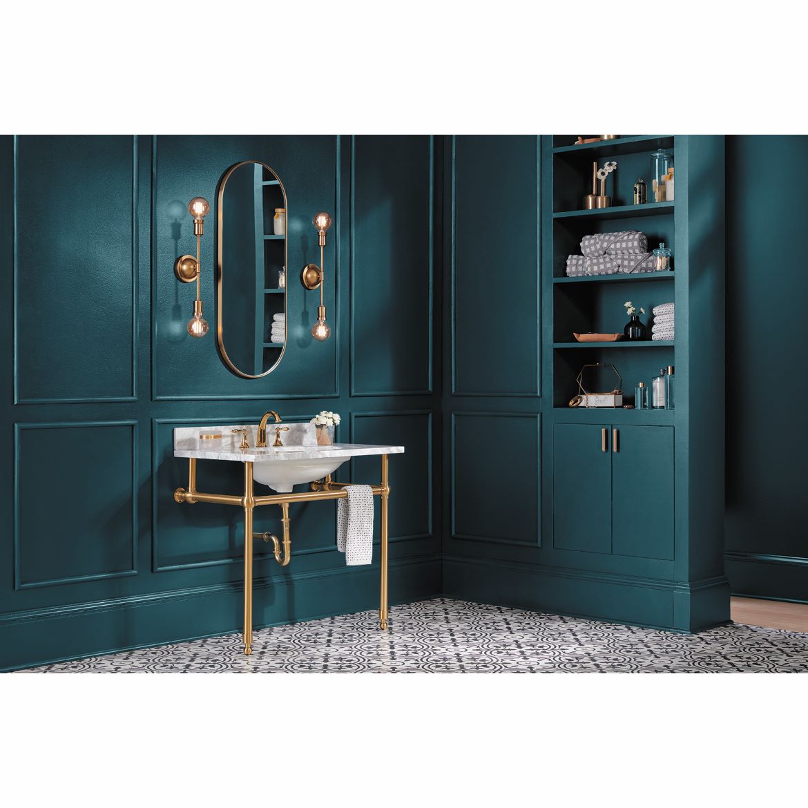
As it did for 2022, Valspar has decided to celebrate 12 popular paint hues rather than one Color of the Year. Everglade Deck, another one of its picks, is a rich blue-green that is a little moodier than Vining Ivy.
For such a chilly color, it possesses an unexpected amount of warmth. Here, it gives a bathroom a bold, sophisticated color.
Sherwin-Williams' Redend Point
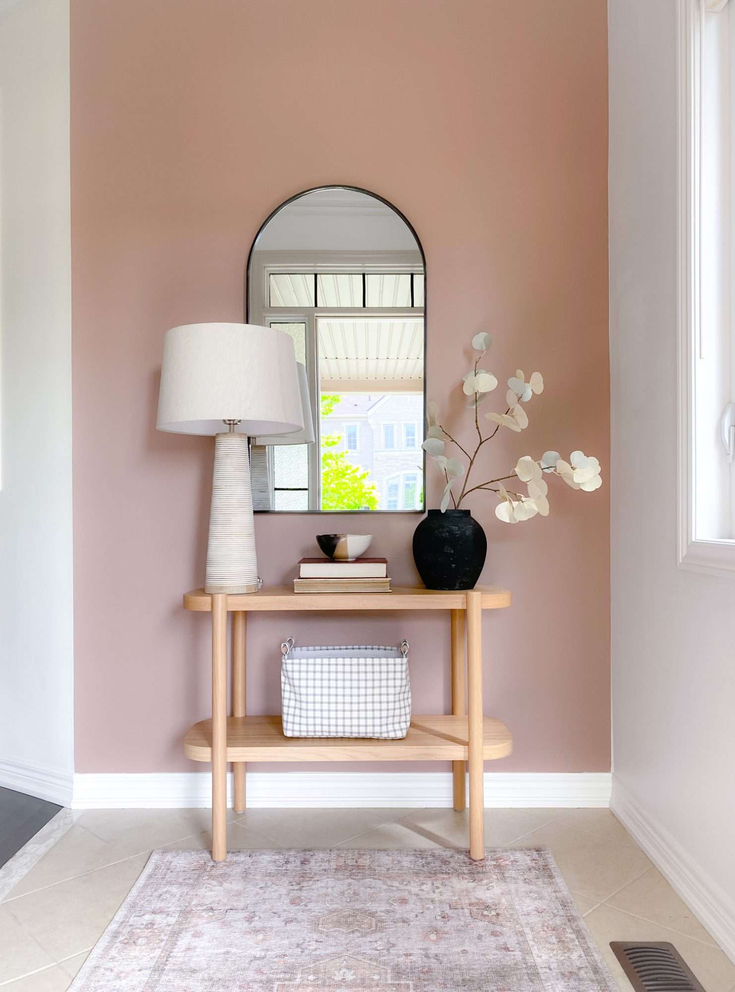
Redend Point is a good option if you prefer softer pinks. It has a delicate coral-pink undertone that gives it a twist and makes it a neutral medium-dark sand color. Not your typical tan, this one.
The color can provide a nice backdrop to hues that are more pink- or orange-forward, as shown above, thanks to the warm pink undertone. However, because it is still neutral, a range of other hues, particularly those that are also on the warmer side of the color spectrum, can be used with it.
North Sea Green 2053–30
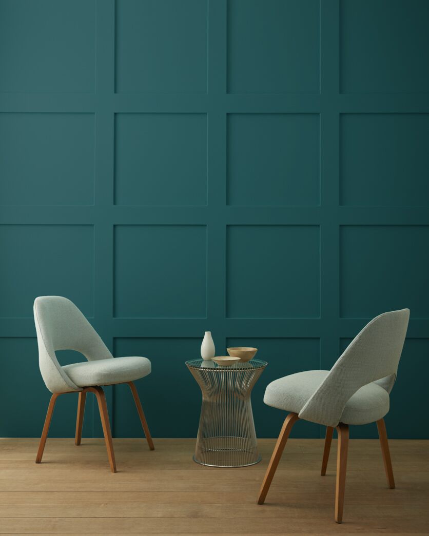
This serene, cold color is captivating, deep, and calming all at once. The heightened jewel tone of North Sea Green 2053-30, which combines blues and greens, is excellent for maintaining quiet without feeling frigid in chill areas like bedrooms and en suite baths.
Dunn-Edwards' Terra Rosa
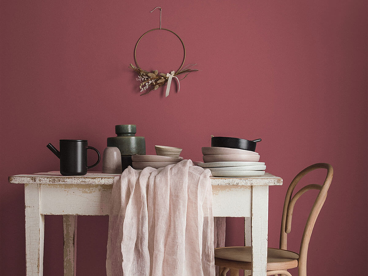
Warmer colors are gaining ground as homeowners continue to like greens and blues. The cinnamon-rose shade Terra Rosa by Dunn-Edwards gives more traditional browns and burgundies a modern twist.
Although it has a little vibrancy, it also has an earthy aspect, which makes it a versatile pink. I can picture utilizing it in more visible locations like dining rooms or front entrances as well as more intimate ones like bedrooms and restrooms.
Wenge AF-180
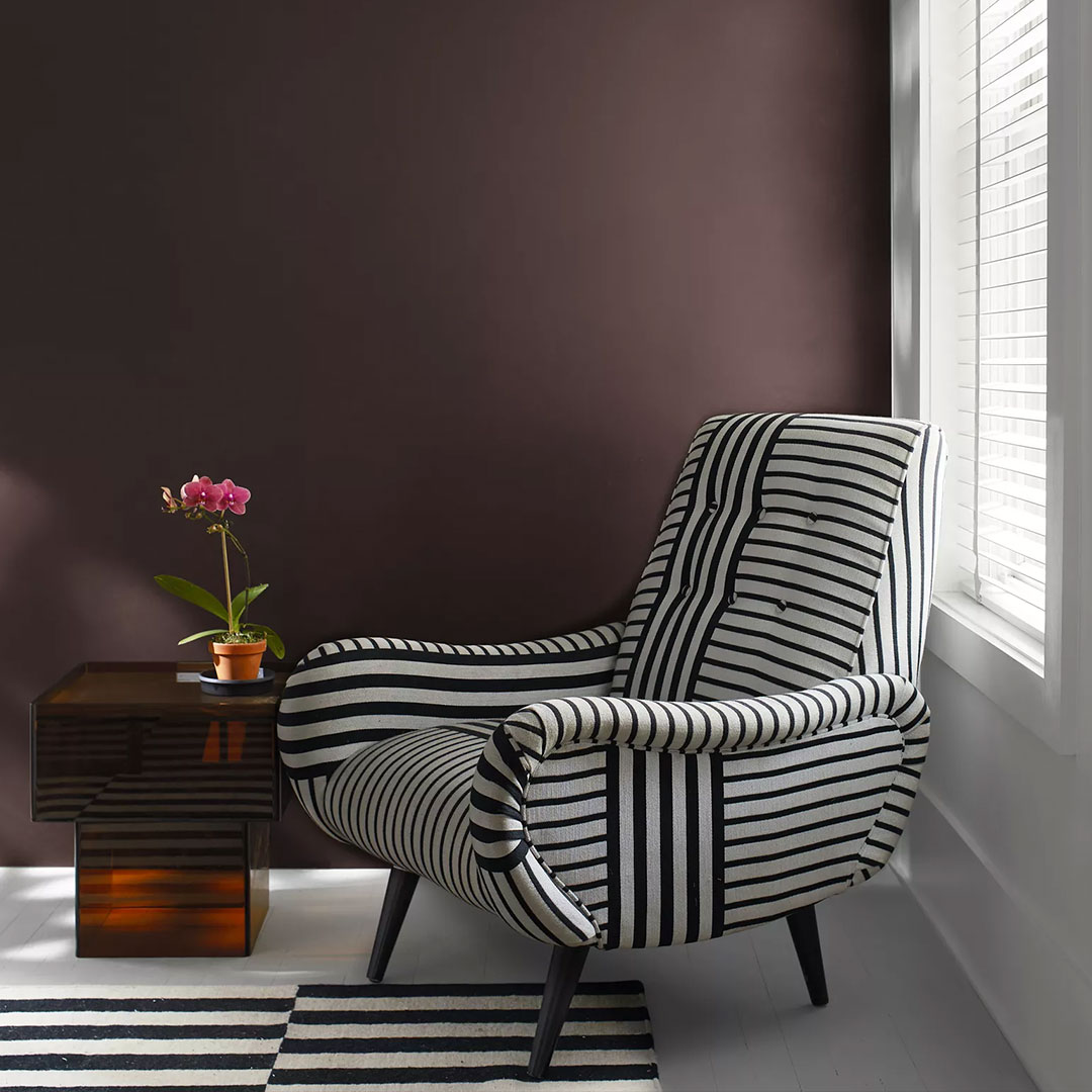
Wenge AF-180 has a hint of refinement. This rich chocolate brown includes undertones of black and violet that give any room a velvety feel. Use this deep color to paint the walls and ceiling of your living area to add the most drama.
Behr Blank Canvas
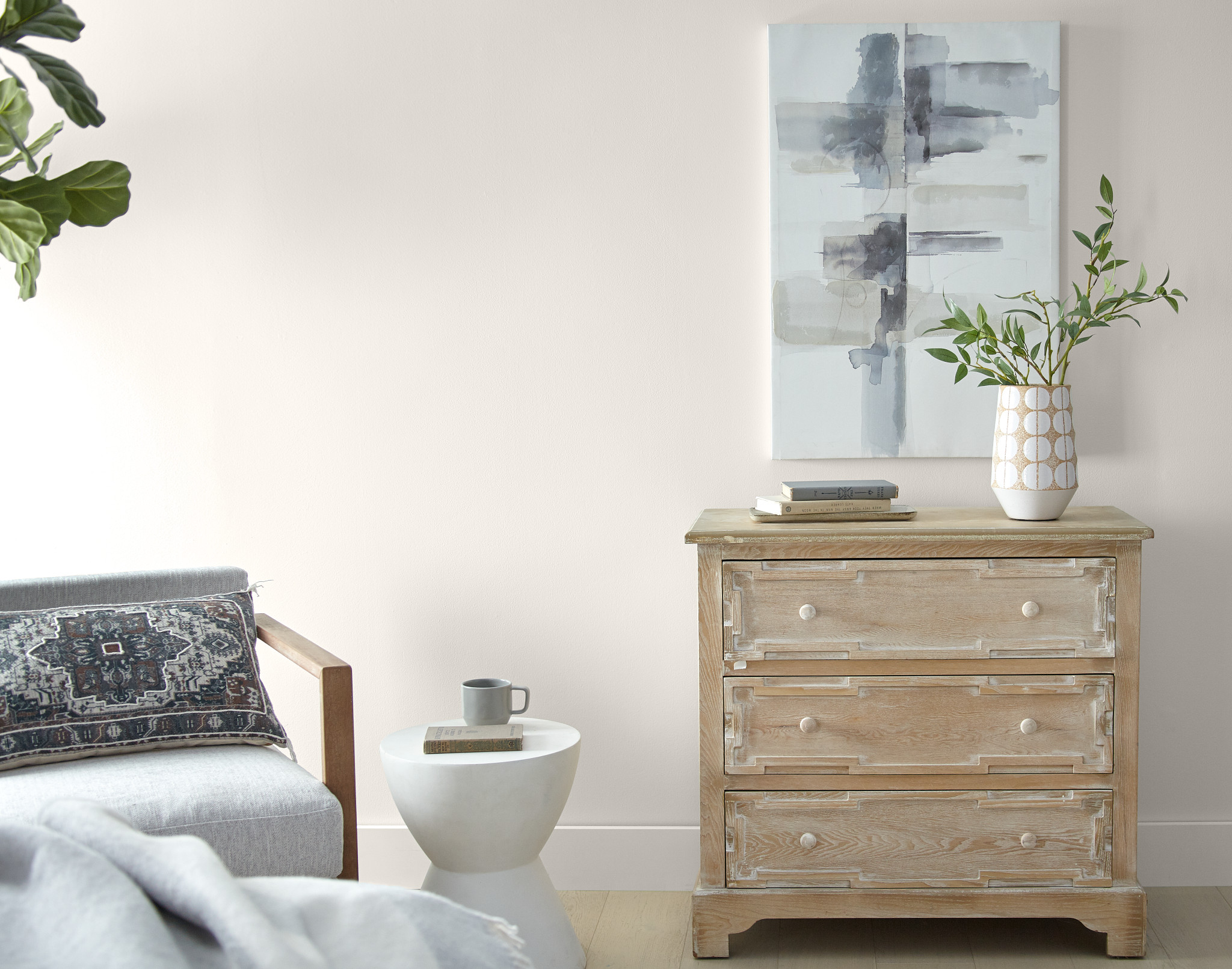
You can't go wrong with Behr's selection of Blank Canvas if you're looking for a blank canvas for 2023. It's fairly obvious that Behr is trying to say something with this decision. And that assertion is that the majority of us probably benefit from a new beginning.
This versatile off-white with a subtle warm tinge can be matched with just about any other color because of its ability to go anywhere. However, because it includes a hint of warmth, it may also be used as the main hue of a space without making it appear excessively sterile or chilly.
